Enhancing Core Modules of a Municipal Resident Portal

Background
The company set out to build a resident self-service portal that municipalities across Israel could adopt and offer to their residents, as a way to manage their municipal accounts digitally, without needing to visit or call their municipality.
My role
I was asked to design 3 modules and 2 authentication flows, as part of a portal redesign project.
Modules
Properties (municipal tax)
Water
Payer account status
Flows
User registration
Voucher registration
The Challenge
Design goals
Full responsiveness for desktop-first components such as data tables.
Empty states for various edge cases.
Unified registration flow.
Meeting AA accessibility guidelines.
Constraints
An existing design system that wasn't fully adapted for mobile responsiveness, requiring new components rather than simple adaptations.
Daily client-driven changes and iterations following the initial purchase.
AA accessibility requirements across all modules.

The most demanding design problem was achieving full responsiveness within a design system whose existing table components had no mobile behavior. The solution required designing replacement components from scratch while staying within the system's visual language.
My approach
The project was delivered in two phases: an initial two-week sprint leading to a sales presentation, followed by a second two-week sprint focused on client adjustments, QA, and production readiness.
What I worked from
1 - System audit
Mapped screens, states, and data fields in the existing system pre-design.
2 - References
Collected references from civic, utility, and financial self-service products.
3 - Design handoff
Reviewed the style kit and existing design decisions with the lead designer to understand where I had creative latitude.
Deliverables
The previous system organized municipal services across separate pages by department rather than by resident task and all three modules used desktop tables without mobile adaptation.
Key decisions
Single-page architecture
Consolidated tax, water, and account information into unified modules with filtering and search.
Tables to cards
Replaced tables with responsive cards that prioritized key information by service type.
modules
Each module was built as a unified single-page experience, consolidating what had previously been spread across disconnected pages.
Properties module
The module unified four previously separate pages into a single view. The primary focus was encouraging residents to register for digital vouchers by direct debit, with unpaid vouchers surfaced as the main CTA.
Year and month filtering and voucher search are available within the same view. Desktop tables were replaced with responsive cards to support mobile use.
Water module
The module prioritized quick comprehension of consumption status. A color-coded graph replaced the row-by-row breakdown, giving residents an immediate visual read of their usage without needing to parse numerical data line by line.

Account status

A cross-service overview covering municipal tax, water, inspection, signage, and additional charges. Payer details are pinned at the top of the view so residents always have their account context visible while reviewing charges.
Outstanding balances are grouped by service type with a direct payment CTA. Desktop tables were replaced with responsive cards.
Flows
Voucher registration flow
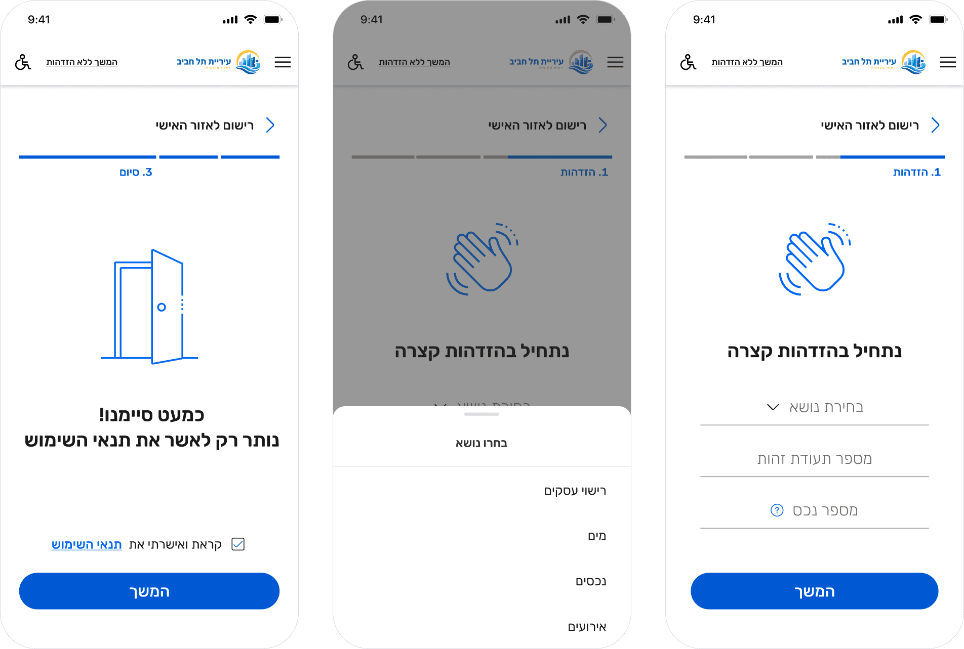
A multi-step flow allowing residents to register for digital municipal tax vouchers delivered by email. Designed to guide residents through a process many were unfamiliar with, with clear progress indication and error handling at each step.

Year and month filtering and voucher search are available within the same view. Desktop tables were replaced with responsive cards to support mobile use.
User registration flow
A new resident registration flow for first-time portal users. Designed to onboard residents of varying digital literacy, with minimal required fields and a clear path from registration to first use.
Design system additions

Responsive components
New data cards built from scratch within the existing design system's visual language. Each card variant was designed for its module's specific data priority, with collapsed and expanded states.
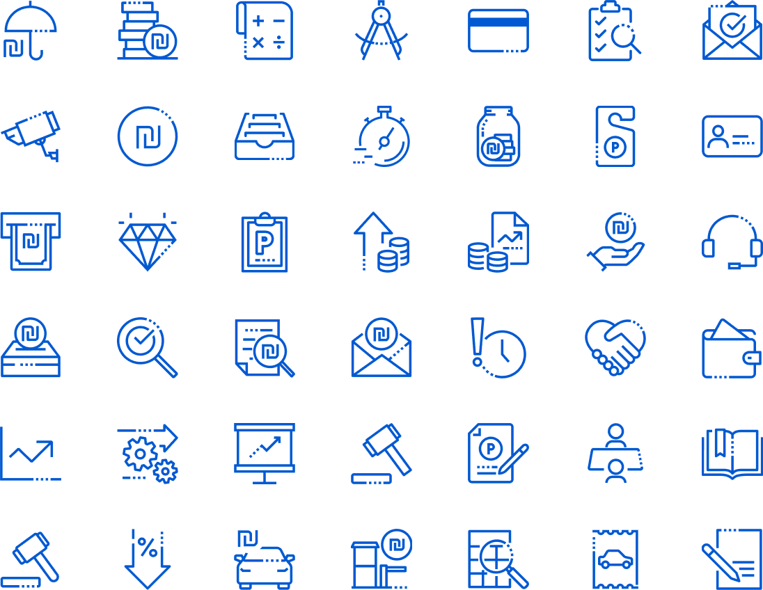
Custom icons
A set of icons for municipal service categories and account status indicators, designed in line with the brand guidelines and added to the design system for use across desktop and mobile contexts.
Impact
Following the first two-week sprint demo, the product was purchased immediately by one municipality. Within days, two additional municipalities followed.
Primary metrics
2 weeks
weeks from kickoff to demo
3
municipalities purchased within days of launch
© 2026 Michal Oring