Redesigning a Legacy GIS Platform for Multi-Level Users
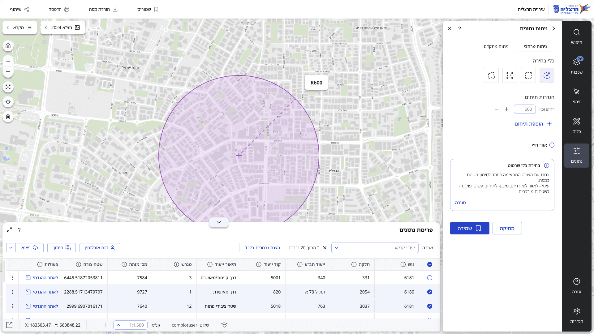
Redesigned the interface from the ground up to simplify complex GIS workflows, improve discoverability, and build a scalable foundation aligned with measurable usability and adoption goals.
Background
GISNET is a leading B2G2C cloud-based GIS platform serving dozens of local authorities, regional councils, and public corporations across Israel.
It enables the management, analysis, and sharing of geographic spatial data through a shared system core, with each client working in a tailored configuration that includes selected GIS layers, tools, integrations, and the client’s logo.
Expanding the Scope
I initiated a follow-up meeting with Complot’s CEO and the GIS team lead, which opened a discussion around user needs and business positioning. As a result, the project scope was reframed from a visual refresh to a full UX redesign, and for the first time, a structured UX brief was defined.
The Challenge
GISNET was built as a powerful GIS system without a structured UX process, and real user needs resulted in complex flows, unclear structure, and a technical interface that was hard to use.

We were designing for a dual audience:
Professional Users (Primary)
Urban planners
Civil engineers
Architects
Municipal GIS managers
Need: Advanced spatial analysis, including measurements, zoning history, visibility and shadow analysis, elevation profiles, and infrastructure sections
General public (Growing priority)
Residents
Small business owners
Real estate developers
Community activists
Need: Simple access to property information including urban plans, permit status, and zoning, without technical jargon.
Stakeholder Goals & Constraints
Stakeholders defined several principles that had to be preserved, alongside new objectives:
Preserve core feature locations to avoid disrupting veteran users' workflows
Maintain brand prominence, ensuring the municipality's logo remains visible even in collapsed interface states
Keep the map as the central screen anchor with maximum display area
Separate desktop and mobile experiences: desktop for professional users, mobile for field surveyors.
Strengthen the system's position as a technological leader in the GIS space
Make the system accessible to non-technical users, including residents
Support integrations with the company's core systems
The client's goal: A visual refresh and cosmetic upgrade for an outdated system.
Our goal (as designers): To examine the system in depth and propose a comprehensive systemic improvement based on user research, market insights, and the existing structure.
My approach
The first phase focused on building a comprehensive picture of the current state. This included a system audit of existing screens and flows, stakeholder interviews to understand business goals and constraints, competitor analysis across 20+ platforms, contextual inquiry sessions with real users, and analytics review through GA4 data.

Research
We began the UX discovery phase by combining a system audit, a competitive research, stakeholder interviews, contextual inquiries and analytics.
This helped us identify key usability issues, unused features, and low engagement with critical tools, all pointing to a gap between the system’s logic and real user behavior.
Competitive analysis
I created a comparative table as part of the competitive analysis, reviewing over 20 GIS systems from Israel and abroad, including CARTO, Mapbox, and HERE.
From that, I developed a focused comparison of 14 key features across 9 selected platforms.

A visual comparison of 14 key features across 9 platforms, highlighting functional strengths, UX patterns, and opportunities for differentiation.
Understanding the users
Our user research began with Complot’s GIS team lead, who also serves as the main point of contact for municipal authorities. His close involvement with support and user feedback gave us a clear overview of common issues, user expectations, and core system strengths.
We then conducted seven contextual inquiries with professionals and residents. Professionals highlighted gaps between the system and their actual workflows, while residents struggled with unclear language and complex filters.
“I became the unofficial tech support for employees across the municipality. The constant calls took so much of my time that I had to create my own training guide, even though an official one already existed.”
— Municipal GIS specialist
Where users drop off
Our goal was to uncover patterns in how users interacted with key features. The data revealed that tools were not accessible enough and users often didn't complete their workflows.
100%
2,812 users
65%
1,827 users
35%
984 users
13%
359 users
Primary drop-off (-30%)
Measurement flow behavior analysis over 28 days using GA4
Additional findings from GA4
Layer management
0.37%
82% activated layers, few used organization tools
Advanced search
0.08%
Very few users found or used this feature
Saved views
<0.1%
No workflow continuity between sessions
Insights
These insights shaped the design direction and informed all solution decisions in the next phase.

Advanced Control Needs
Professional users wanted more control, flexibility, and precision in tools.

Hidden Functionality
Core tools were hidden, and some actions couldn't be completed.

Onboarding Confusion
Basic users didn’t know how to start a task or what the next step was.

Search Friction
Search provided unclear feedback and required unnecessary steps
Guiding Principles
Discoverability
Clear entry points and navigation, consolidated actions, progressive disclosure, and contextual guidance through onboarding, visual feedback, and inline help.
Flexibility
Editable tools at any stage, save and recall functionality, persistent export access, map presets, and integrations with existing systems.
Scalability
Consistent navigation patterns, streamlined search with clear feedback, and a modular, component-based system designed to support future growth.
Exploration
The exploration phase focused on shaping the interface structure based on the research findings. Starting with information architecture and continuing through low fidelity wireframes, each iteration refined how users would navigate, access tools, and interact with the system.
Information Architecture
I initially considered separating interfaces for basic and advanced users, aiming to meet their distinct needs through tailored experiences. However, due to system-level permission constraints, I designed a unified and flexible structure that supports multiple user levels within a single interface. This is how I addressed it:


Consolidated four tool zones into a single, cohesive layout
Introduced a Global Actions Zone for all output-related operations
Created a new Data Analysis category by reframing existing tools
Aligned tool placement with each control’s logical role in the map interface
Wireframe Breakdown
Following the Information Architecture phase, we moved into defining the layout that would translate structural clarity into usable interface zones.
My goal was to design a map-first experience that supports hierarchy, scalability, and contextual interaction, while keeping distractions to a minimum.
The annotated Main Screen wireframe below captures how these priorities shaped the foundation of the product’s main screen.

1
Sidebar Navigation
Single entry point per primary flow. Integrated search. Scalable, clear hierarchy.
2
Global Header
Persistent branding as requested. Central hub for export, print, share, and presets.
3
Quick Tools Cluster
Zoom, measure & navigation grouped as floating buttons. Always accessible on map.
4
Map Dominance
70%+ viewport preserved. Legend & base layer toggle moved to floating controls.
5
Contextual Panel
Consistent panel pattern from each sidebar action. Predictable, scalable, supports hierarchy.
6
Minimal Status Bar
Reduced to essentials: coordinates, scale, user status.

This wireframe served as a foundation for rapid usability testing with internal stakeholders.Based on feedback, we iterated on visual clarity, component types and ux patterns.
Deliverables
Design System
As part of the redesign, I built a Design System from scratch to replace an inconsistent UI with a unified and predictable visual language.

The system is token-based, with a structured component library and fully defined interaction states. It was designed entirely for RTL from the ground up, including spacing logic, and built to ensure accessibility, clarity, and long-term scalability.
The Interface
The redesign preserves the full capability set of the legacy system while reorganizing it under a single navigation hierarchy. The structure is built for repeated daily use rather than isolated tasks.
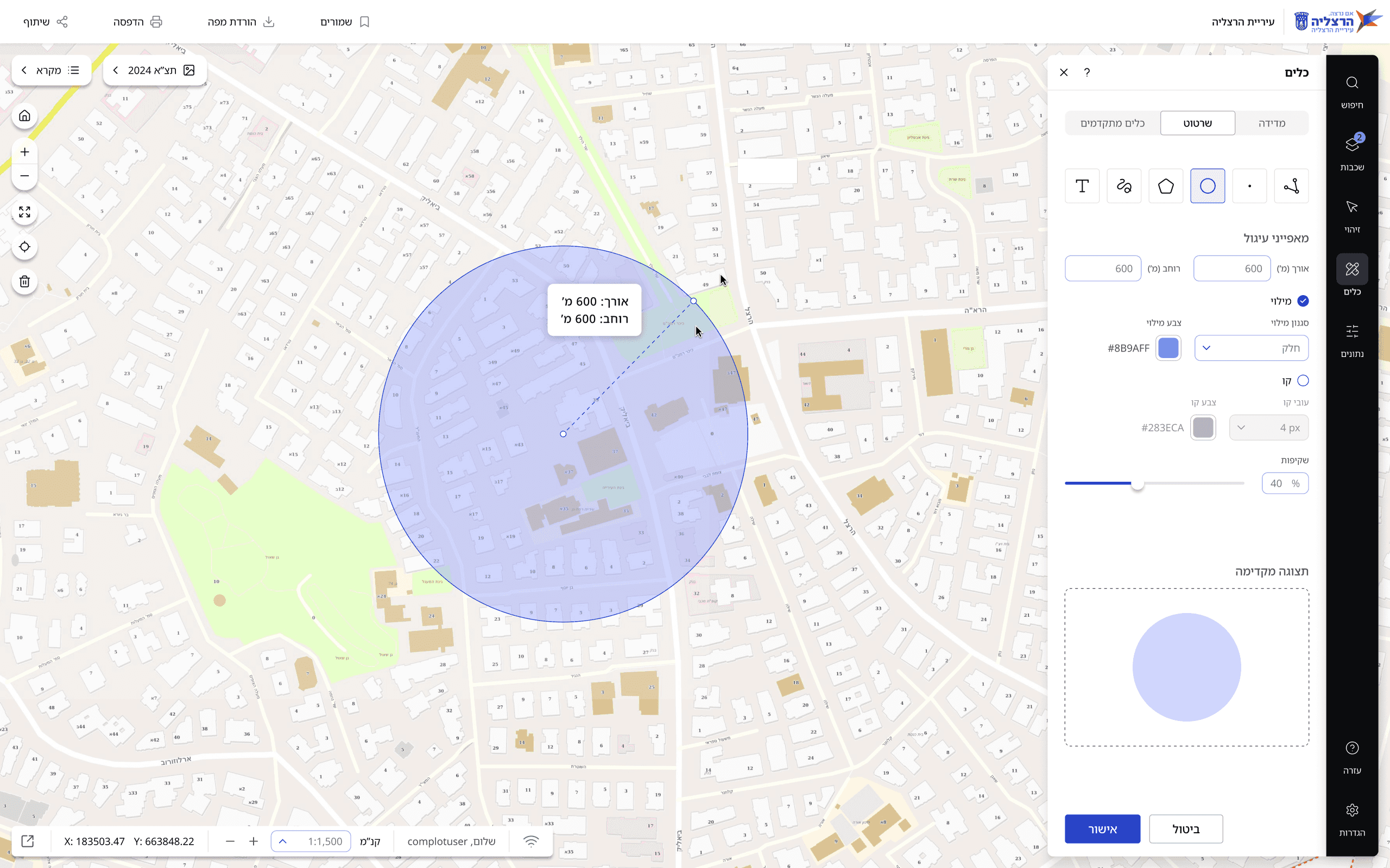
What Changed
Actions can be edited, saved and revisited
Measurements and analyses can be adjusted during or after completion, saved, and reopened from history. Line, shape and color styling is editable in place.
Analysis output and source data visible together
During advanced analysis, map changes and the entity data table stay on screen at the same time, so results can be read against the underlying records without leaving the view.
Export and share moved to the header
Export, print, share, saved items and presets were each reachable only after a specific sequence of prior steps. They now sit in one header panel, available at any point in the session.
Legend and base layer moved to floating controls
Switching between map and aerial view, or opening the legend, previously meant closing the active tool and reopening it afterwards. Both now sit over the map and can be changed while a tool is active.
Advanced tools consolidated under Tools
Functions were regrouped by purpose rather than legacy placement, merging spatial analysis with advanced analysis under a single entry point.
Tooltips and explicit system states
Tooltips guide multi step flows, and progress, success and failure states are shown explicitly.
Layers

The legacy system organized layers directly under categories, with global transparency control and no option to keep the legend open alongside the layer panel.
The redesign introduces a three-level hierarchy of categories, subcategories, and layers, allowing complex datasets to be organized more clearly. Each layer now has individual transparency control, while favorites and quick access tabs make frequently used layers easier to reach.
Active layer counts are shown per category, with a summary panel displaying all currently active layers at a glance. The legend can also remain open alongside the layer panel, removing the need to switch back and forth between the two.
Measurement tool
Users can now edit measurements after creation and access previous measurements through a dedicated history. Clear instructions within the panel also make the tool easier to understand and use.

Advanced analysis
Advanced analysis was transformed from a technical, SQL-like interface into an intuitive visual tool. The legacy modal required users to construct queries using raw operators and field codes, with no visual feedback until execution.
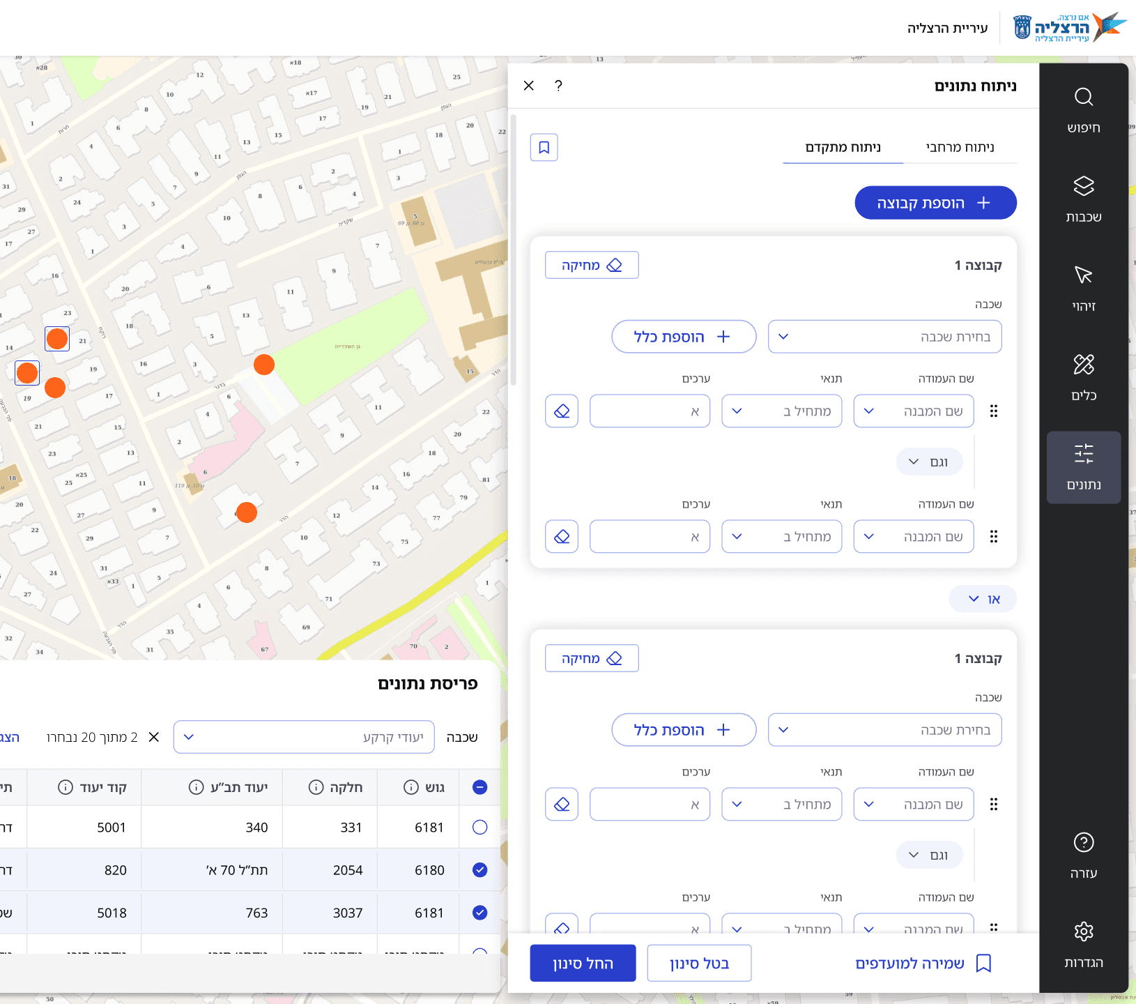
The redesign introduces a group-based query builder. Users select layers, add rules with clear conditions, and combine them using natural language operators.
Results appear in real-time, both in a data table and as markers on the map.
Validation
Design completed and system is in advanced development stages. Initial pilot planned for Q2 2026, including 50 users from different sectors: professional users, citizens, and advanced users.
Current Status
Design completed and system is in advanced development stages. Initial pilot planned for Q2 2026, including 50 users from different sectors: professional users, citizens, and advanced users.
Pilot group
50 users across all segments for 4 weeks
A/B testing
Search placement, layer categorization, measurement flows
Refinement
Weekly analytics, bi-weekly user interviews
Accessibility
Third-party WCAG 2.1 AA audit before rollout
Throughout specification and design, I examined the system's ability to grow and adapt to future uses. Concepts explored included mobile version, personalized dashboards, collaborative work features, and role-based interface variations.
These capabilities weren't implemented in this phase due to MVP focus, but were considered in architectural decisions, user flows, and Design System structure. The choices made reflect clear product priorities while building infrastructure that enables future expansion without fundamental system changes.
This project began as a visual refresh request but evolved into a comprehensive UX redesign through research-driven initiative. I created new information architecture, a flexible design system, and infrastructure for capabilities that didn't previously exist.
The significant improvement in usability, navigation, and ability to perform complex actions was built on deep understanding of users and organizational needs.
© 2026 Michal Oring